Oxford Health Foundation NHS Trust.

Transforming Oxford Health NHS Foundation Trust’s LMS – a UX Success Story
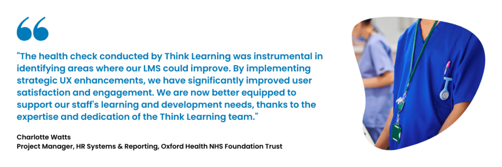
The Oxford Health NHS Foundation Trust’s LMS system is an essential tool in their commitment to staff learning and development. However, like many robust systems, it had room for improvement. Through a targeted health check conducted by Think Learning, we identified key areas where the system could evolve to better meet the needs of its users. This case study highlights the journey of transformation, showcasing how strategic UX enhancements, grounded in the NHS design system, can elevate a system’s effectiveness and user satisfaction.
In September 2023, Think Learning embarked on a mission to assess and enhance the Oxford Health NHS Foundation Trust’s LMS system.
The Objective:
To unlock the system’s full potential by improving user interface, experience, feature utilisation, and reporting capabilities, all while ensuring alignment with NHS design standards for usability and accessibility. Our approach was comprehensive. We engaged with a wide array of stakeholders, conducted in-depth system analysis, and facilitated collaborative discussions.
The Result:
A series of insights and recommendations transformed the LMS from a functional learning tool into a seamless, intuitive experience for all users, enhancing accessibility and leveraging the familiarity and reliability of the NHS design system, as defined by the established standards of usability, accessibility, and consistency in design.
The Challenge
While the Oxford Health NHS Foundation Trust’s LMS system was already serving its purpose well, several pain points were identified:
- Complex Navigation: The existing navigation structure, with its multiple dashboards and sub-menus, was functional but not intuitive. Users found it cumbersome to access the information they needed quickly.
- Outdated Homepage Design: The homepage, although informative, lacked the visual appeal and accessibility that modern users expect, especially in a system where users are accustomed to the NHS design language.
- Scattered Learning Dashboards: Multiple dashboards for different types of learning content were causing confusion and inefficiency.
- PDR and Supervision Dashboards: These dashboards were functional but lacked the clarity and usability needed for optimal user interaction.
- Managerial Reporting: Managers needed a more streamlined way to access and interpret team data without sifting through overwhelming reports.
- Search and Filtering Limitations: The course catalogue search functionality was underperforming, making it difficult for users to find relevant courses quickly.
The Solution
Our team approached these challenges with a user-first mindset, focusing on creating an experience that was not only functional but also enjoyable and intuitive. Central to this approach was the adoption of the NHS design system, which guided the UX enhancements to ensure that the system was accessible, familiar, and trustworthy for all users.
Simplified Navigation
To reduce complexity, we proposed a streamlined main menu that consolidates related dashboards and removes unnecessary sub-menus. The new navigation structure, aligned with NHS design standards, offers a more logical flow, enabling users to find what they need with minimal effort.
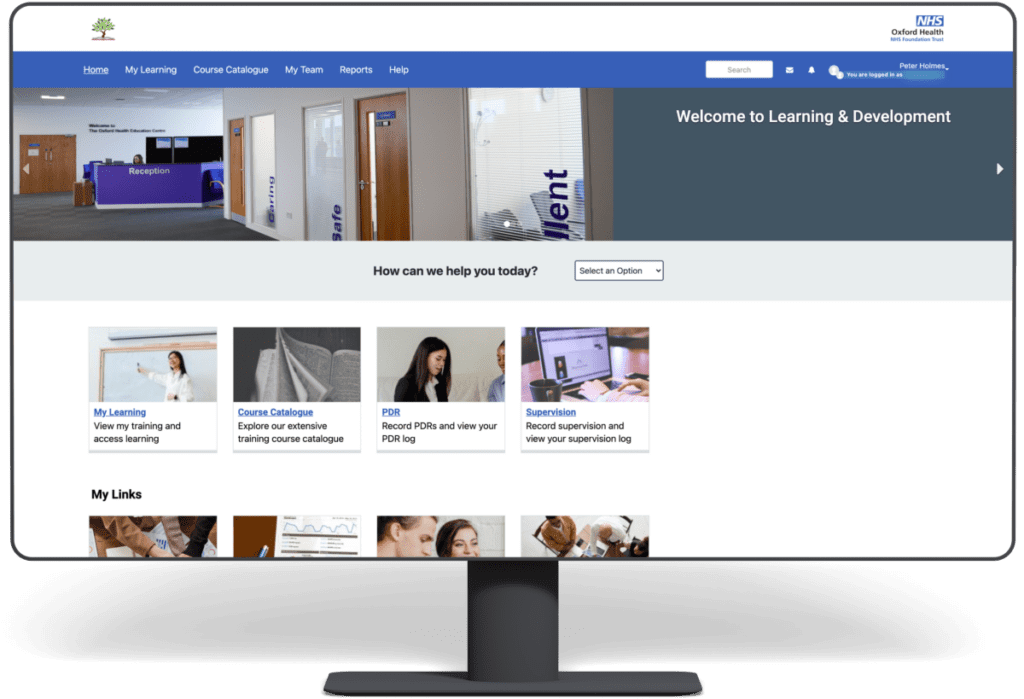
Homepage Redesign with NHS Design System
The redesigned homepage embraces modern design principles while being firmly rooted in the NHS design system. This ensures not only a visually appealing layout but also one that is accessible to all users, including those with disabilities. The design principles from the NHS system—such as clear typography, consistent layouts, and intuitive navigation—were applied to create a homepage that feels familiar and trustworthy.
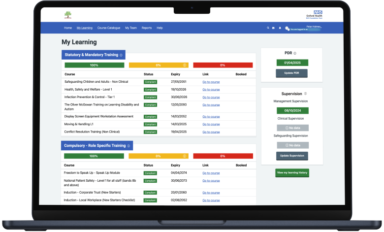
Unified Learning Dashboard
We introduced a single, cohesive ‘My Learning Dashboard’ that brings together all necessary learning content in one place. This dashboard can be tailored using either a ‘Radial Learning’ block for a dynamic, action-oriented interface or a more traditional multi-block layout for those who prefer a detailed overview. Both approaches were designed with the NHS design system in mind, ensuring consistency across the entire user journey.
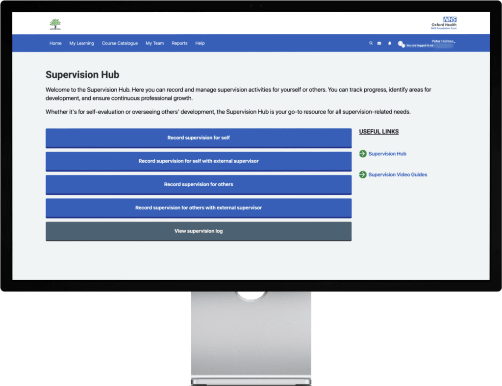
Enhanced PDR and Supervision Dashboards
Both the PDR and Supervision dashboards received a makeover, with a focus on clarity and ease of use. These redesigned dashboards now provide users with an intuitive interface that simplifies key actions like starting or editing a PDR. The use of NHS design elements ensures that these dashboards are not only easy to use but also accessible to all staff, enhancing the overall user experience.
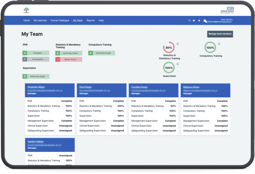
Manager Dashboards & Reporting
To address the needs of managers, we developed a dual-dashboard solution: the ‘My Team Dashboard’ for a quick snapshot of team performance and the ‘Reporting Dashboard’ for deeper insights. These dashboards are designed to provide managers with the information they need, when they need it, without overwhelming them with data. By using NHS design principles, these dashboards are not only effective but also foster a sense of familiarity and ease of use.
Enhanced Course Catalogue UX
The course catalogue was revamped to provide a more intuitive user experience, aligned with the NHS design system’s principles of simplicity and accessibility. The redesign focused on streamlining navigation and making it easier for users to explore and access relevant courses. Previously, filters were not being used effectively and were confusing for users, so they have been hidden until further improvements can be made. This improved layout enhances overall usability, ensuring that users can efficiently find and engage with the learning resources they need, all within a familiar and trusted design framework.
The Impact
The transformation of the Oxford Health NHS Foundation Trust’s LMS system is a testament to the power of user-centred design, particularly when grounded in a trusted design system like that of the NHS. By focusing on the needs and behaviours of end users, we were able to significantly enhance the system’s usability and effectiveness.
Increased User Satisfaction
The streamlined navigation and redesigned dashboards, rooted in the NHS design language, have made it easier for users to interact with the system, leading to increased satisfaction and engagement.
Improved Efficiency
Managers now have quick access to the insights they need, enabling them to make informed decisions faster and more effectively. The familiar design system enhances their confidence in navigating the tools.
Enhanced Compliance
With clearer, more intuitive dashboards and automated compliance emails, the system now better supports users in maintaining 100% compliance with mandatory training and other requirements.
Conclusion
The Oxford Health NHS Foundation Trust’s LMS project exemplifies how targeted UX improvements, underpinned by the NHS design system, can transform a functional LMS into an outstanding user experience. By prioritising the needs of users and focusing on intuitive, accessible design, we not only solved existing pain points but also elevated the overall effectiveness of the system.
This case study serves as a blueprint for other organisations looking to optimise their own LMS. Through thoughtful UX design and strategic enhancements, aligned with trusted design systems, you too can unlock the full potential of your systems, driving greater engagement, efficiency, and satisfaction.
Want a learning platform that will really create impact? Then you’ve come to the right place. Get in touch to learn more about our services and solutions.